Evolution of HHS, LLC's brand identity

2016-2020

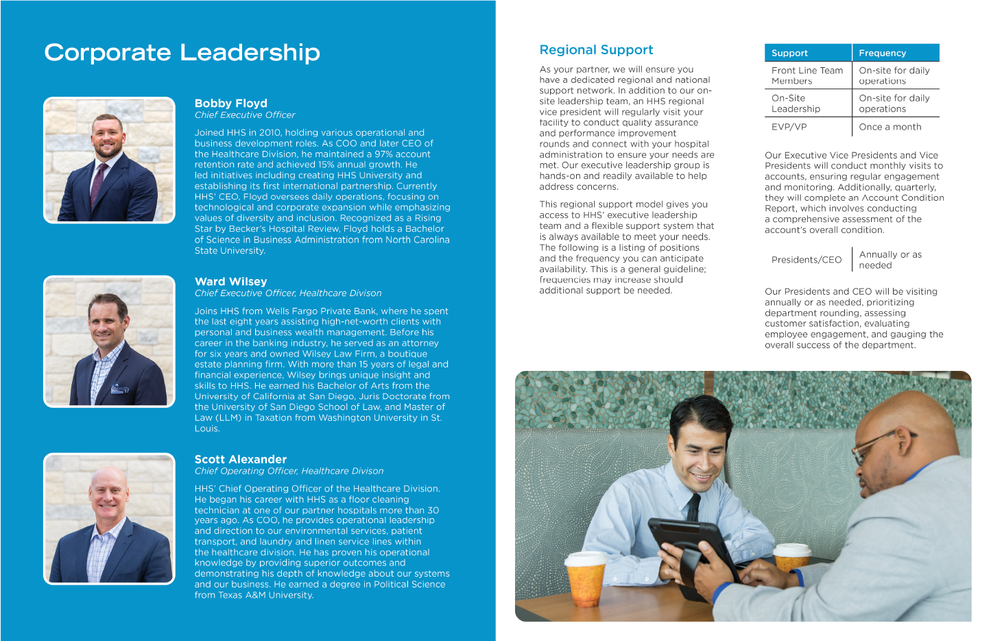
Bubbles were the primary brand element. Little to no consistency across media platforms. As the company grew and diversified its offerings beyond cleaning hospitals, the bubbles did not scale well and gave off a dated appearance.

2020-2021

  • 2020 - Removed the bubbles from the brand elements and began to use the primary HHS blue in materials to strengthen brand recognition

  • 2021 - Redesigned all marketing collateral (presentation, brochures, one pagers, case studies, etc.)

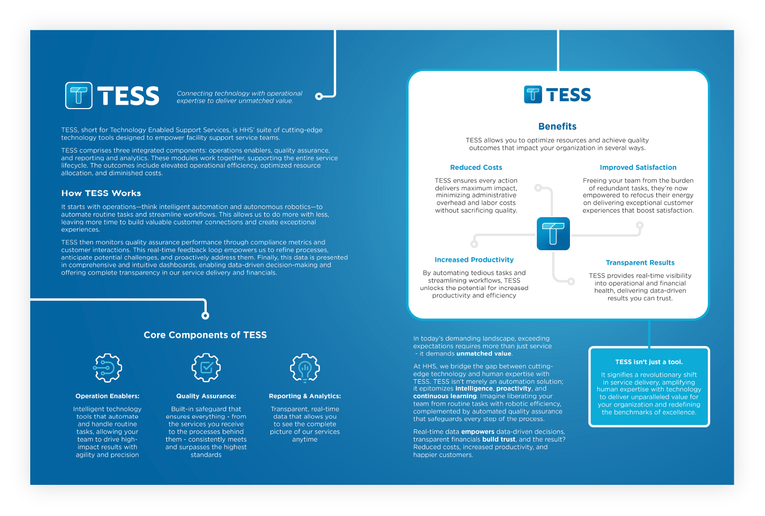
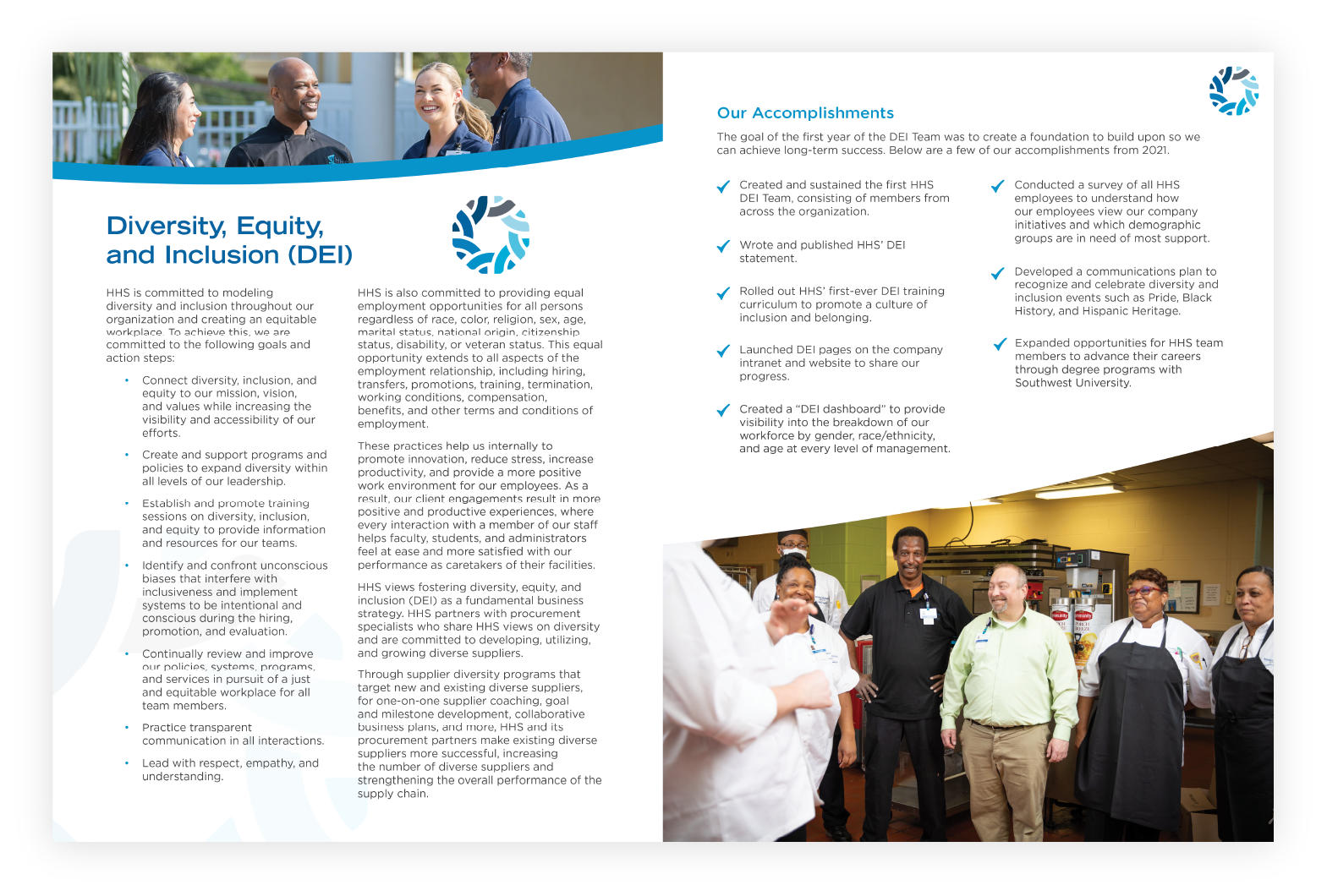
2022-2024

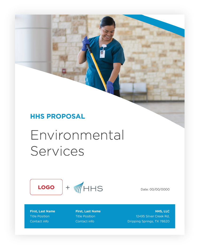
  • Implemented the use of curved shapes as a brand element to reflect the HHS swoosh logomark

  • Created consistency across design assets

  • Removal of stock photography and began using real photos of real team members
  • Will is just freaking loyal and committed. What needs to get done, gets done, and I could not appreciate that more. I also love how even when dealing with many [challenges], he doesn’t stop ideating and dreaming of how “it” or we as a team could be better.

    Director of Digital Marketing, HHS

  • I love whenever I really get to collaborate with Will. He’s such a great guiding force for the design team, and he really knows how to pull the best out of your work. Sometimes when things aren’t quite right the first (or second, or even third) time, instead of feeling dejected, he reminds me a lot that design really is a collaborative effort and that where you might not see something, someone else can figure out the finishing touch from your setup.

    Graphic Designer, HHS

Next
Next

Nourished